Dispatch
How I would find iOS app niches before building
The best niche research is not hunting for a magic keyword. It is finding a small job with visible demand, weak alternatives and a buyer you can understand.
July 8, 2026 · Michael at Yuzool
A lot of app ideas start with taste: “this would be nicer,” “I wish this existed,” or “I can build a cleaner version.” Taste matters, but it is not enough.
Before building an iOS app, I want to know whether a real group of people already search for the job, complain about the current options, and understand the value quickly from a listing.
That does not mean every app has to begin with a spreadsheet and a cold calculation. The best small apps usually come from a mix of lived irritation and visible demand. You notice a workflow that feels clumsy, then you look for evidence that other people are feeling the same friction.
I like this approach because it keeps the early decision honest. You are not asking “is this a cool idea?” You are asking “can I describe a specific person, a specific job, and a specific reason this should exist on their phone?”
Start with jobs, not categories
“Productivity” is too broad. “Habit tracker” is still broad. “Habit tracker for shift workers” is closer to a niche because it points at a specific life pattern and a reason generic apps may feel wrong.
I would list jobs people already perform: logging symptoms, tracking invoices, preparing workouts, studying vocabulary, planning meals, monitoring revenue, managing client follow-ups. Then I would ask which version of that job is underserved on iPhone.
The useful detail is usually hiding inside the constraint. A “meal planner” becomes more interesting when it is for people cooking around allergies, for gym clients following a coach plan, or for parents who need repeatable packed lunches. A “study app” becomes more interesting when it is for a specific exam, language, or practice rhythm.
Those constraints do two things. They make the product easier to design, and they make the App Store listing easier to understand. A focused app can use the customer’s own words instead of trying to sound impressive to everyone.
Look for expensive workarounds
A good niche often has an awkward workaround already in place. People might be using Notes, spreadsheets, screenshots, reminders, Google Forms, templates, or a much larger product that was never made for the job.
That workaround is useful evidence. It shows the job matters enough that people are already solving it somehow. The app opportunity is not always to invent a new behaviour. Sometimes it is to make an existing behaviour less fragile, faster, more private, or more pleasant on a phone.
I would pay special attention to workflows where the phone is naturally present: capturing something in the moment, checking progress away from a desk, sending a quick update, scanning a receipt, logging a health or fitness detail, or making a small decision in context.
Read the weak signals in competitors
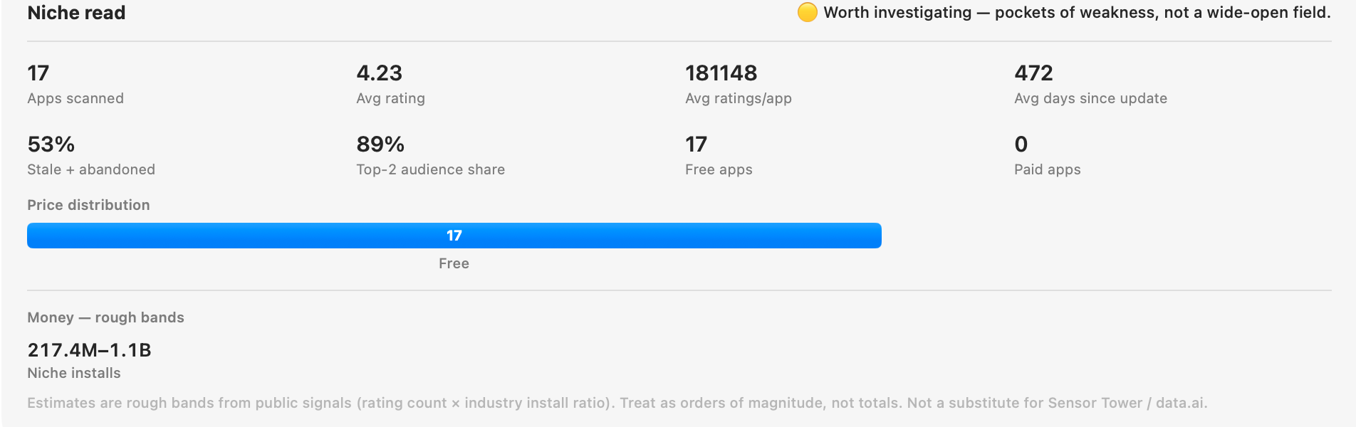
Competitors are not bad news. They prove that people understand the job. The question is whether the current options leave a specific opening.
Look for old screenshots, vague positioning, subscriptions on tiny utilities, frustrated reviews, missing privacy language, weak onboarding, or apps that serve everyone and therefore speak clearly to no one.
Reviews are especially useful because they tell you where the promise breaks. A one-star review might complain about sync, pricing, account creation, export, ads, or an interface that became too complicated. A five-star review can be just as useful because it shows the feature people actually value.
I would not copy a competitor’s feature list. I would look for the emotional shape of the category: what people are relieved by, what they resent, what they keep asking for, and what they seem willing to pay for. That is more useful than a giant matrix of checkmarks.
Use keyword research as a sanity check
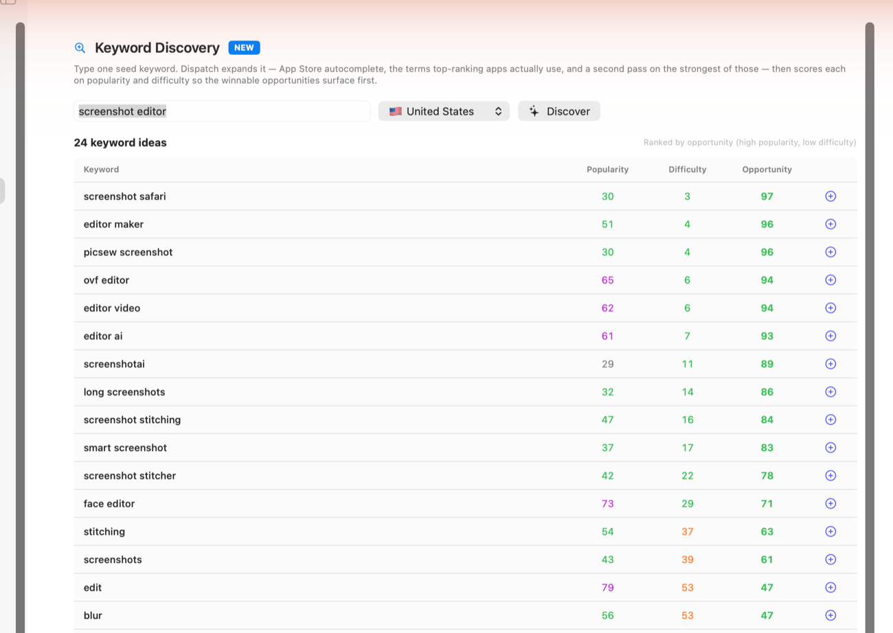
Keyword research should not choose the product for you. It should test whether the language around the idea exists.
If nobody searches for the exact thing, there may still be a market, but the launch becomes harder. You will need education, audience, distribution or a stronger reason for people to care. If people already search for the job, your listing can meet them halfway.
I like to group keywords by intent rather than treating them as isolated phrases. Some keywords describe the category, some describe a pain, some describe a use case, and some describe an alternative. “Invoice tracker” and “receipt scanner” are not the same kind of search, even if the same person might need both.
For an iOS niche, I want enough search language to write a natural title, subtitle, keywords, screenshots and a small website page. If I cannot write those without sounding vague, the niche may not be ready.
Check whether the buyer is reachable
Some niches look good until you ask how the buyer will find the app. App Store search can help, but I would still want at least one other path: a website search page, a small community, a workflow blog post, a comparison page, a Reddit thread, a newsletter audience, or a clear phrase people search on Google.
This is where the site and the App Store can support each other. The App Store catches people already browsing for an app. The website can explain the workflow in more depth, compare alternatives, answer privacy questions, and give Google more context about what the app is for.
Choose a wedge small enough to win
The first version should not compete with every app in the category. It should win a small promise: faster setup, clearer privacy, better for freelancers, better for Japan-based users, better for one file type, better for one workflow.
A good iOS niche is not necessarily tiny. It is specific enough that your app can sound like it was made for someone.
The wedge is also a product discipline tool. It tells you what not to build yet. If the app is for “freelance invoice follow-up,” then team dashboards, accounting integrations and project management features can wait. The first version needs to make the follow-up easier.
That focus is good for marketing too. A small app with a clear promise is easier to recommend than a broad app with a dozen half-explained features.
The test I like
Write the App Store subtitle before building. If the promise is hard to explain in one short line, the niche may still be too vague.
Then write three review snippets you hope customers might leave. If those reviews sound generic, the product may not be specific enough yet.
For example, “great app” is not a useful target review. “Finally, a habit tracker that works around night shifts” is much stronger because it tells you the customer, the pain and the reason the app exists.
If the imagined reviews are specific, the screenshots almost write themselves. The first screenshot can show the main outcome, the second can show the workflow, and the third can answer the obvious doubt. That is the point where an app idea starts to feel like a product instead of a cloud of features.
My rough checklist
Before committing serious build time, I would want a short answer to these questions: who is this for, what do they currently use, why is that annoying, what phrase do they search, what would they pay to avoid, and what one promise can the first version make clearly?
If those answers are still fuzzy, I would keep researching. If they are sharp, I would build the smallest useful version and prepare the App Store listing alongside the product, not at the end.