Technology
No Results Page UX: Copy and Recovery Examples
Improve no-results page UX with clearer messages, useful recovery actions, preserved search terms and examples for empty searches and filters.
Published September 16, 2026 · Michael at Yuzool
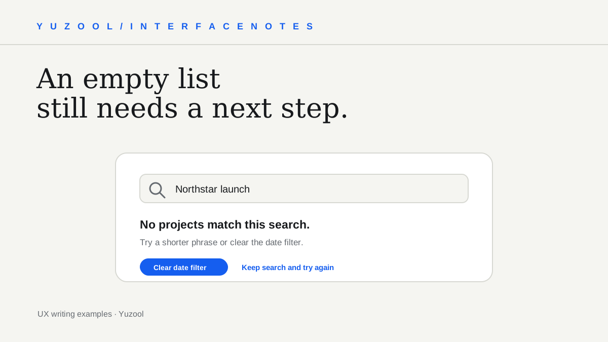
A no-results page is a small moment with a clear job: explain why the current view is empty and help the person take a useful next step. “No results found” reports the state, but it leaves the user to work out whether the search was wrong, the filters are too narrow or the content does not exist.
Good empty-state copy is specific to the action that produced it. Keep the person’s search or selections visible, describe what the interface checked, and offer a recovery that does not make them start over.
First identify which empty state you have
Several different situations can look like a blank list:
- Search returned nothing: The submitted words match no items.
- Filters removed every match: Results exist, but the current combination hides them.
- The account is new: There is no content yet because the user has not created anything.
- A request is still loading or failed: The interface does not yet know whether results exist.
Do not use the same message for all four. A failed request should offer a retry, not suggest changing a search term. A new account should explain how to create its first item, not tell the user to broaden a query they never entered.
Write copy that names the current state
For a search with zero matches, keep the query in view and name it plainly:
No projects match “Northstar launch.” Try a shorter phrase or clear the date filter.
For a filter combination, make the cause more explicit:
No invoices match these filters. Clear one filter to see more invoices.
For a new workspace, invite the first useful action:
Your workspace is ready. Create a project to keep its tasks and updates together.
These examples are starting points. Use the nouns people already see in the product, not internal team terminology. If the system can identify a specific restrictive filter reliably, name it; if not, avoid pretending to know why the results are missing.
Offer a recovery that preserves effort
Put the most likely next step close to the message. Depending on the interface, that might be:
- Clear all filters while keeping the search term.
- Remove one selected filter at a time.
- Suggest a shorter or corrected query when the match is clear.
- Show a nearby category or recent items as an optional route.
- Let the user create the first item when the account is genuinely empty.
Make destructive or broad actions distinguishable. “Clear filters” should not also erase the search, delete saved preferences or reset unrelated form fields. If you provide multiple options, make the primary one obvious and keep secondary links quieter.
Handle spelling suggestions with care
If the product can confidently identify a likely typo, offer the corrected query as a choice: “Search instead for …” Keep the original available. Do not silently replace the user’s words, especially for names, codes, product identifiers or specialist terms where an unfamiliar spelling may be intentional.
When there is no confident correction, a general suggestion is safer: check the spelling, try fewer words or remove a filter. Do not show a list of made-up alternatives just to make an empty screen look busy.
Keep the query and context visible
When a search returns nothing, preserve the user’s query in the search field. When a filter caused the empty state, show which filters are active and let the person remove them. Hiding the inputs that created the state makes it harder to understand and recover from it.
On narrow screens, make the recovery action visible without requiring a long scroll. Keep the message concise, and avoid placing a large decorative illustration between the explanation and the next action. If there is genuinely nothing else the user can do, say so plainly rather than presenting a dead-end button.
Test the empty state on purpose
Do not wait for a real person to stumble into an empty result. In a test environment, use a query that should return nothing, combine filters until the list is empty, and open a brand-new account. Check that each state gets the correct message and action.
Ask someone unfamiliar with the page what they think happened and what they would do next. If their answer differs from your intent, adjust the wording or the controls and test again. Also verify the reset action: it should restore a useful view without dropping information the person meant to keep.
A no-results screen cannot guarantee that every search will find something. It can make the absence understandable, preserve the user’s work and provide an honest path forward. That is enough to turn a dead end into a small, considered part of the product.