Apps & Tools
How to Build an App Store Screenshot Sequence That Explains the App
A practical App Store screenshot sequence for a small iPhone app: what to show first, how to write benefit-led captions and how to make the first three frames work together.
Published September 19, 2026 · Michael at Yuzool
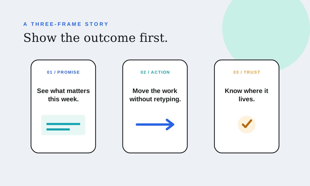
An App Store screenshot sequence should answer one question before it tries to show every feature: why should this person download the app now?
The screenshots are often the first real explanation someone sees after the icon, name and subtitle. Apple recommends sequencing assets so they tell a cohesive story that reflects how someone uses the app. That makes the order important: the first frame earns attention, the second adds proof and the third resolves a likely objection.
Start with the job, not the feature list
Before opening a design tool, write the user’s job in one sentence. “Plan a realistic week when client work moves” is a job. “Drag and drop tasks” is a feature. The job should shape the first screenshot because it gives the reader a reason to care about the interface.
For a weekly planning app, the opening frame might show a real week with a clear headline such as “See what matters this week.” The screenshot should make the result visible immediately: days, tasks and the decision the app helps someone make. A title that only says “Weekly view” asks the reader to do too much interpretation.
A useful first-three sequence
Screenshot one: the promise
Show the main outcome in the context where it happens. Use a short headline that can be understood at thumbnail size. Avoid a splash screen, logo-only frame or a sentence about the technology underneath.
The question this frame answers is: “Is this for my problem?”
Screenshot two: the distinctive action
Show the interaction that makes the app different or unusually pleasant. A board might show unfinished work moving from Thursday to Friday without being recreated. A receipt app might show a receipt becoming a categorized expense with the original currency retained.
The question this frame answers is: “How does this help me?”
Screenshot three: the trust detail
Use the third frame to make the decision safer. Show sharing, privacy, export, offline behavior, reminders, iCloud sync or the small detail that removes hesitation. Do not assume a reader will search the description for a requirement that matters to them.
The question this frame answers is: “Can I live with this?”
Later screenshots can go deeper: secondary workflows, integrations, advanced settings and edge cases. They are useful, but they should extend a clear story rather than repair a confusing opening.
Write captions for outcomes
Good screenshot copy is not a transcript of the screen. It is a caption for the change the user wants. “Move unfinished tasks without starting over” is stronger than “Task movement.” “Keep every pet record ready for the vet” is clearer than “Health timeline.”
Keep the wording short enough to scan. One idea per frame is easier to remember than a paragraph of benefits. Use the same position, type scale and voice across the sequence so the frames feel like one explanation.
Do not make claims the product cannot demonstrate. If sync requires iCloud, say iCloud sync rather than implying a universal cloud service. If the app is designed for iPhone only, do not write copy that suggests a Mac version.
Use the real interface as evidence
Decorative marketing panels can make a screenshot look polished while hiding the product. Keep the app interface large enough to read and frame the moment that supports the caption. Crop out empty chrome when it does not add context, but do not enlarge a detail so much that the reader cannot tell where it belongs.
Check the first three frames at the size people will actually see them in search results. If the headline becomes a grey blur or the controls cannot be distinguished, simplify the frame. A beautiful full-size composition can fail when reduced to a small card.
Match the page to the search intent
Someone searching for “weekly planner for freelancers” needs a different opening than someone arriving from a general productivity feature. The title, subtitle, keywords, screenshots and landing page should describe the same job with compatible language.
For Cadence, that might mean making the Mac and iPhone pages clearly about a native weekly task board for freelancers and independent workers—not another endless task list. The Cadence product page gives the longer explanation, while the weekly planning guide explores the underlying workflow.
Change one narrative at a time
If you use Product Page Optimization, create a genuinely different treatment: a different first promise, a different screenshot order or a different visual emphasis. Duplicating the original assets does not create a useful experiment. Apple’s asset guidance recommends a cohesive sequence, and its optimization tests are designed to compare real alternatives.
Record the change, the date, the storefronts and the question you are testing. Give the page enough time and traffic to produce evidence. A small sample can suggest a direction, but it should not be treated as a universal winner.
Final screenshot checklist
- The first frame names a user outcome.
- The second frame shows the app’s distinctive action.
- The third frame answers a trust or setup question.
- Captions are readable at thumbnail size.
- The interface is real and large enough to inspect.
- The wording matches the app name, subtitle and landing page.
- The sequence is truthful about devices, sync, privacy and pricing.
The strongest screenshot sequence feels less like an advertisement and more like a fast product tour. In three frames, someone should understand the problem, see the useful moment and know what kind of commitment the download represents.